Weather Weirdness Meter
Interactive app that compares current weather to historical hourly data and computes statistical "weirdness" for multiple conditions.
Overview
A web application that compares current weather observations to historical weather for the same location, date, and hour, and quantifies how unusual the current conditions are using statistical measures. The project demonstrates data ingestion from external APIs, time series preprocessing, statistical anomaly scoring, and an interactive visualization layer suitable for exploratory analysis.
Problem
I wanted a quick, data‑driven answer to questions like “Is it unusually warm for today?” Existing consumer apps show current conditions but do not contextualize them against historical distributions for the same location and time of year. The goal was to build a reproducible tool that converts raw weather observations into interpretable, statistically grounded “weirdness” scores.
Solution
- Data sources
- Current observations from OpenWeatherMap; historical hourly data from Open‑Meteo.
- Data pipeline
- Geocoding user input to lat/lon.
- Timezone normalization and alignment of current and historical timestamps.
- Historical aggregation by calendar day and hour to build conditional distributions (e.g., all past Dec 8 at 06:00 for a location).
- Missing value handling and outlier filtering before computing statistics.
- Statistical method
- Compute mean and standard deviation for each weather variable conditioned on location, calendar date, and hour.
- Convert current observation to a z‑score: z=x−μσ.
- Map z‑score to categorical labels:
- Normal: ∣z∣≤1
- Hmm: 1<∣z∣≤2
- Weird: 2<∣z∣≤3
- Super Weird: ∣z∣>3
- Provide both categorical label and continuous z‑score for downstream analysis.
- App features
- Interactive location input and variable selector (temperature, humidity, wind, etc.).
- Table and chart views showing current value, historical mean, standard deviation, z‑score, and percentile.
- Option to export raw historical subset for further analysis or reproducibility.
- Implementation notes
- Built with Streamlit for rapid prototyping and interactive exploration.
- Core analysis implemented in Pandas/NumPy; Matplotlib used for static plots.
- API calls wrapped with retry/backoff and basic caching to limit redundant requests.
Impact
- Personal analytics tool that turns a subjective impression (“feels warm”) into a reproducible, quantitative statement.
- Reproducibility: raw historical subsets can be exported for independent verification or further modeling.
- Transferable skills demonstrated: API integration, time series preprocessing, statistical feature engineering, and interactive visualization—directly relevant to data analyst / data scientist roles.
Gallery
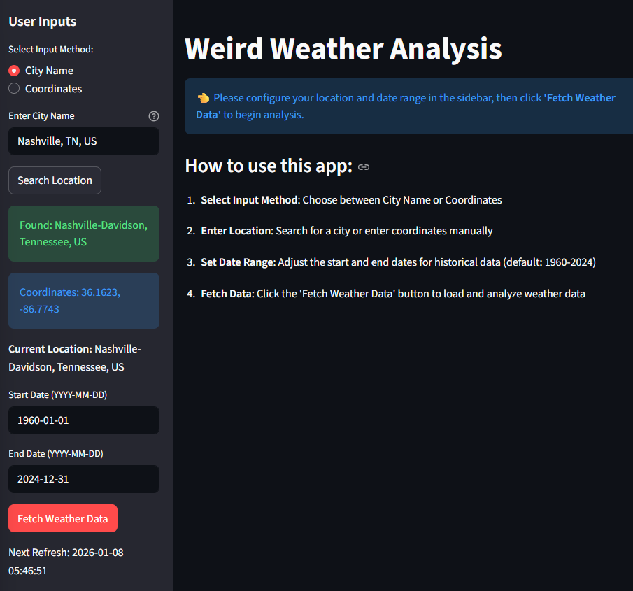 Initial User Input Panel
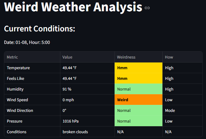 Result Weirdness Table
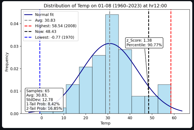
 User select dropdown for condition analysis (temperature selected)
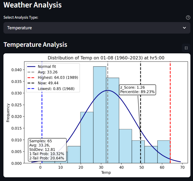
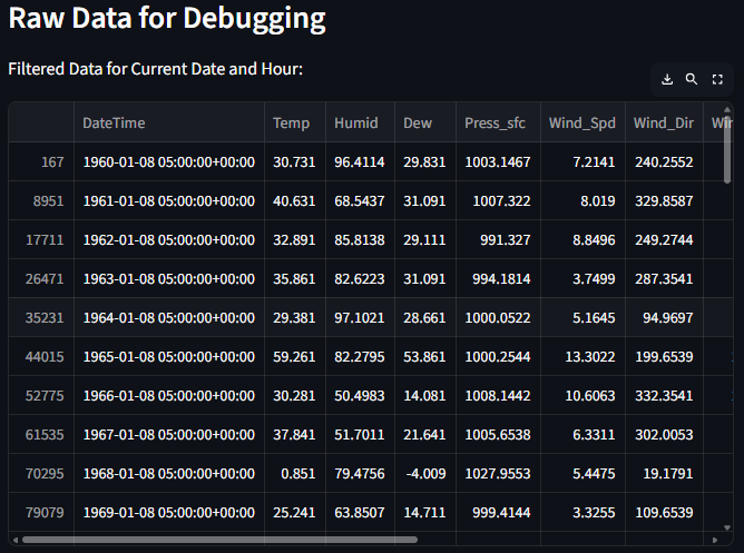 Raw data export option for debugging or further analysis
Code Repository
Source code available on GitHub: https://github.com/jdwasner/Weird-WX
Future Improvements
High priority
- Statistical rigor
- Replace single‑point z‑scores with seasonally adjusted models (e.g., rolling windows, LOESS smoothing, or seasonal decomposition) to better capture trends and reduce false positives.
- Add confidence intervals and percentile ranks so users see uncertainty, not just a label.
- Validation
- Backtest anomaly labels on historical events (e.g., known heat waves) to measure true/false positive rates and calibrate thresholds. Medium priority
- Usability
- Improve UI: clearer legends, colorblind‑friendly palettes, and inline explanations of statistical terms.
- Add presets for common locations and a permalink/shareable state for reproducibility.
- Performance and deployment
- Move from Streamlit sharing to a dedicated for multi‑user access. Longer term / Data science extensions
- Modeling
- Train a probabilistic model (e.g., Gaussian Process or seasonal ARIMA) to predict expected distributions and detect anomalies with model‑based likelihoods.
- Feature expansion
- Incorporate additional covariates (elevation, land cover, nearby water bodies) to improve local historical baselines.
- User interaction
- Add user accounts and historical alerting (email/push) for anomalous conditions; instrument usage metrics to measure engagement.