Deep Dive WebApp
A data‑driven investigation platform that centralizes raw data, routing, and correlation analysis to accelerate root‑cause discovery for PE/QE teams.
Problem
Process and Quality Engineers frequently encountered groups of product IDs behaving as statistical outliers. Investigating these required jumping between multiple systems, manual Excel work, and ad‑hoc SQL queries. The workflow was slow, inconsistent, and difficult to reproduce.
Solution
I designed and built a modular web application that centralizes data retrieval, visualization, and statistical analysis for outlier investigations. The app connects directly to the SQL datalake, performs backend analysis in Python, and renders interactive Plotly.js visualizations in the browser for fast, responsive exploration.
Key Features
 Home landing page with links to all 4 modules
Raw Module
- Query raw parameter data by time, process, and parameter
- Interactive time-series, heat maps, violin plots
- On‑plot selection with instant statistical summaries
- Exportable raw data table
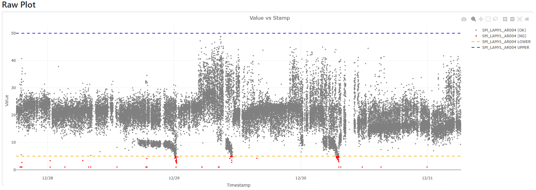 Raw Plot: Parameter Data over Time with out of bounds data displayed red
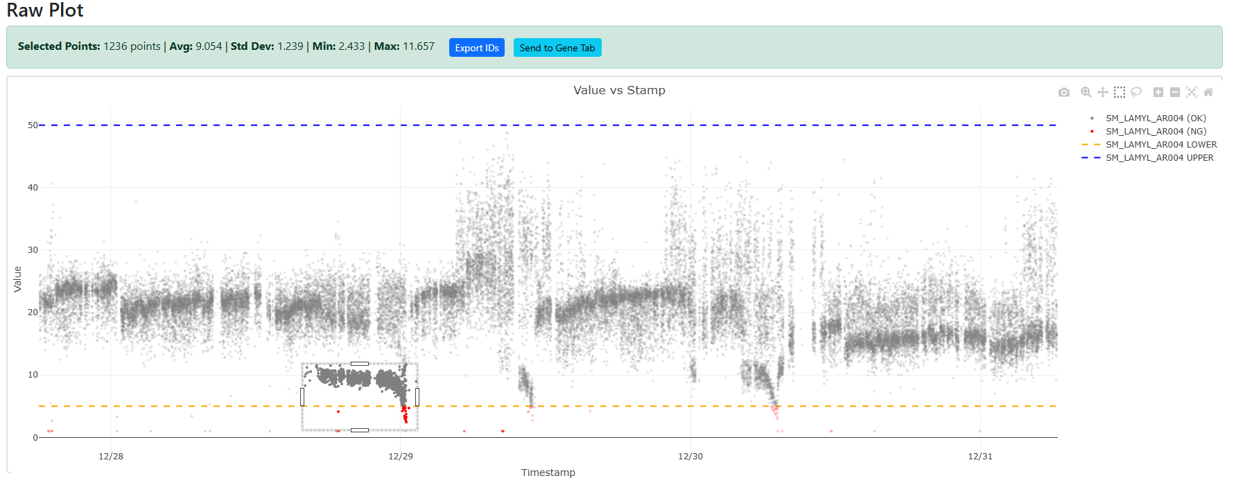 Raw Plot: Suspect area of data selected for export or Gene Analysis
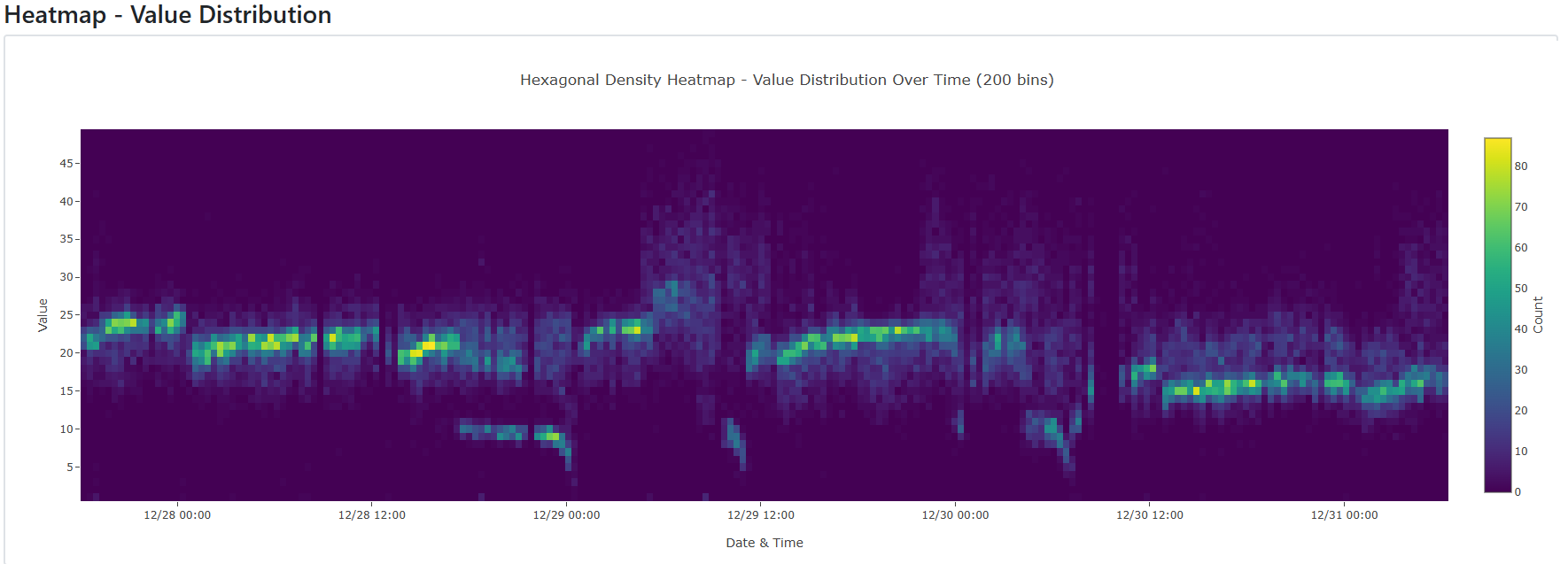
Raw Heatmap: Same data set as raw plot but heatmap to show localized density
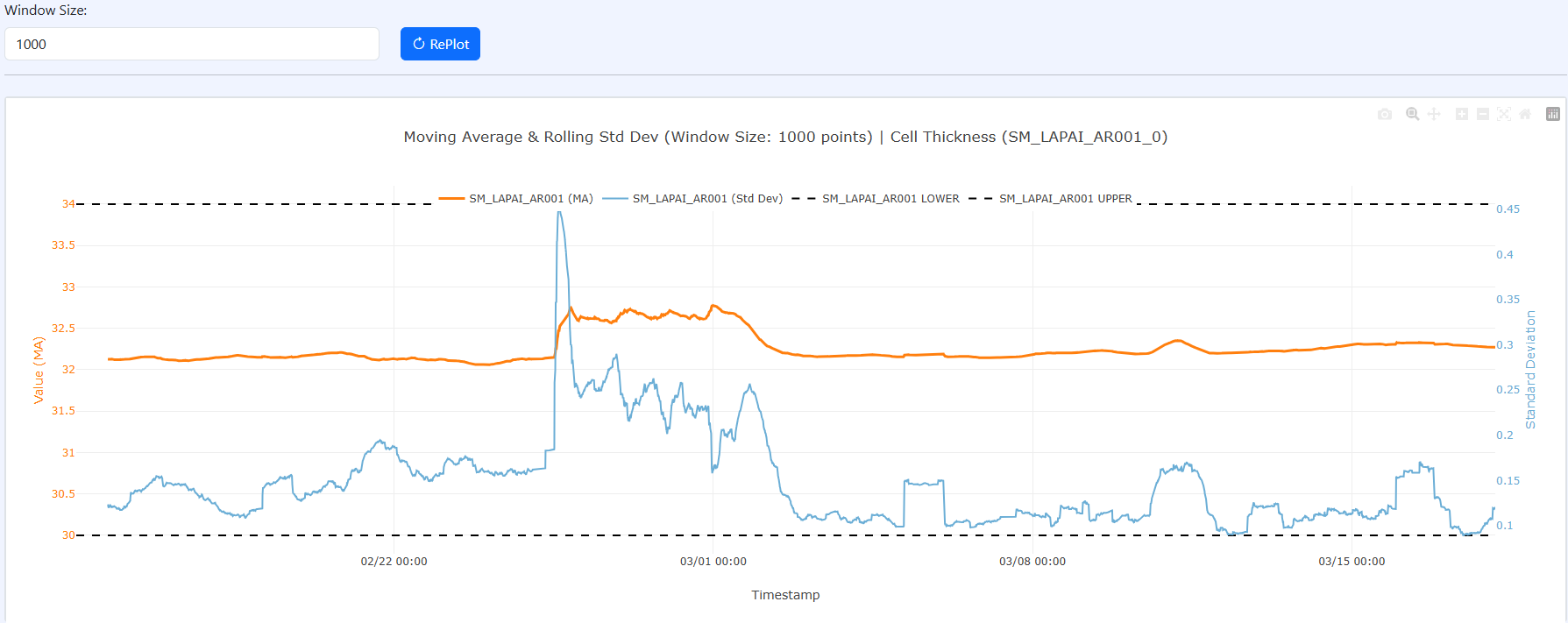 Moving Average and Standard Deviation (with user input window size)
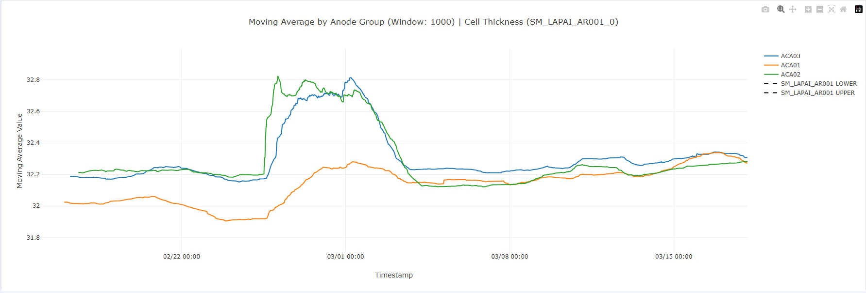 Moving Average by Upstream Equipment
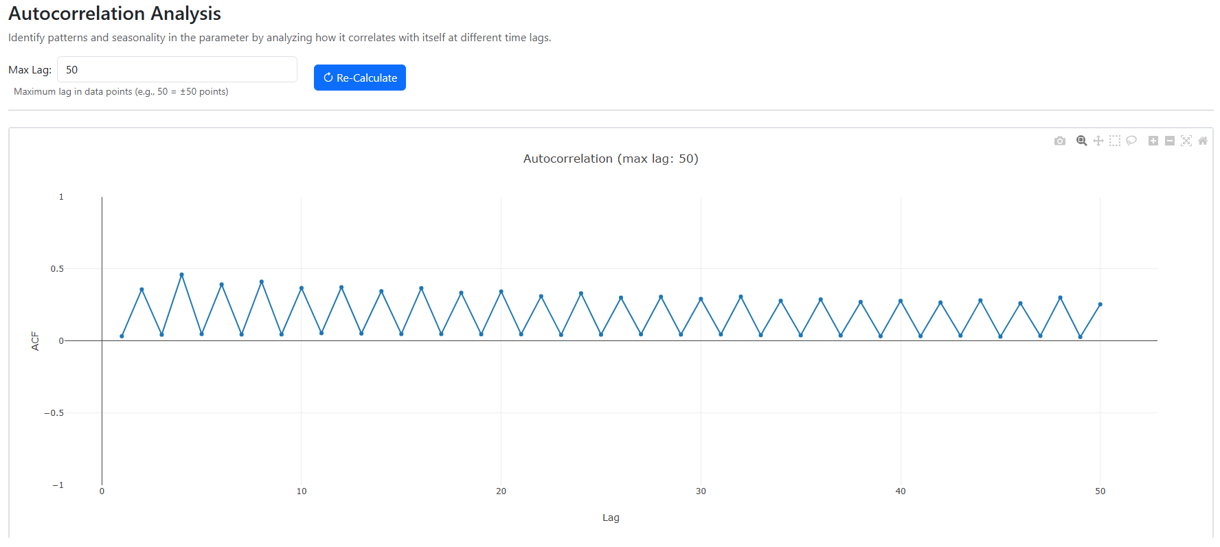 Autocorrelation Analysis: See if any lags result in high correlation
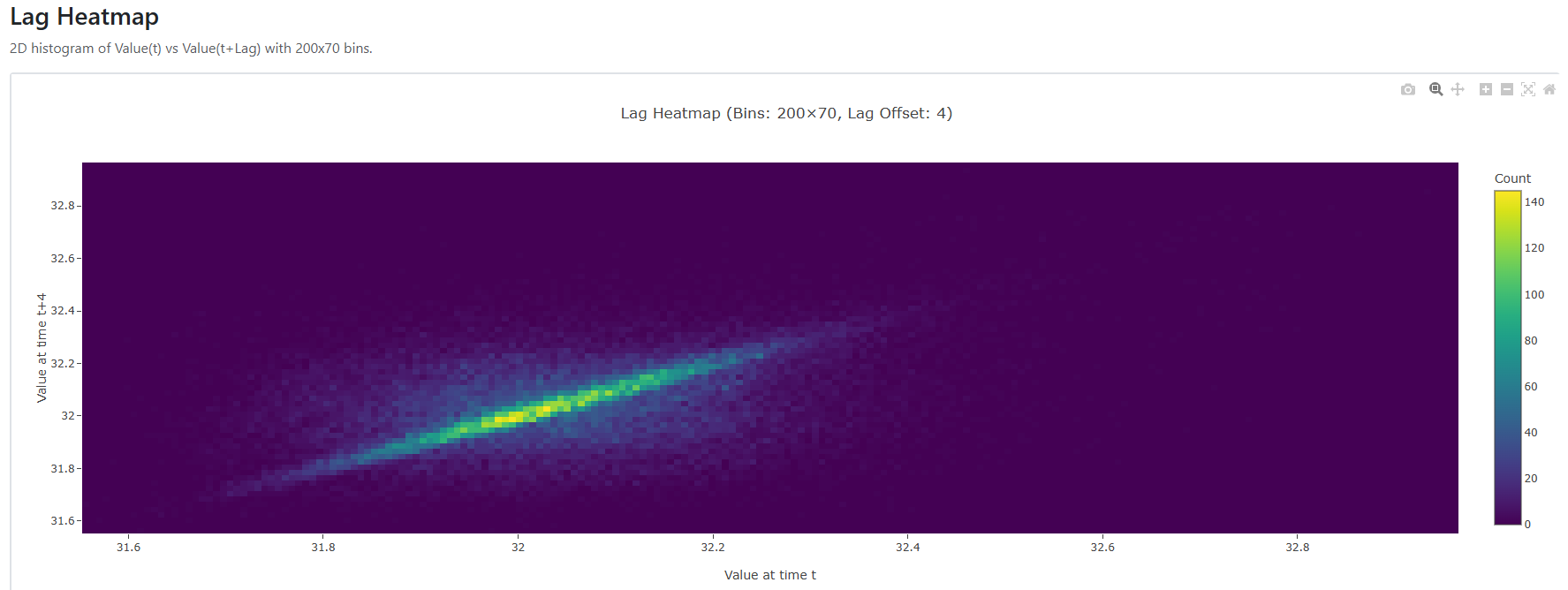 Lag Correlation Heatmap: Shows heatmap of scatter plot that plots the selected lag on a single variable (in this case 4)
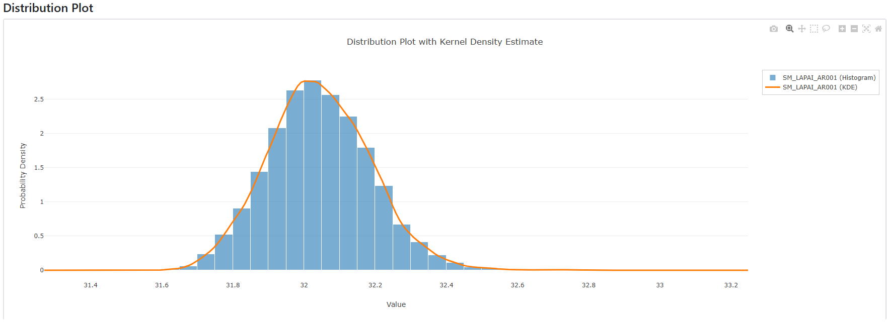 Histogram of raw data with KDE overlay
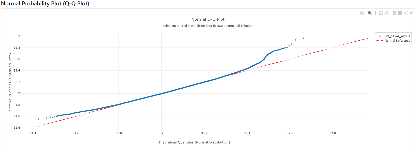 Q-Q Plot: to show how normal the data is
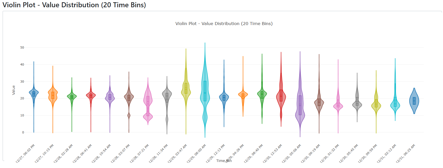 Raw Violin Plot: Same data set as raw plot but violin plot to show distribution change over time
Gene Module
- Trace suspect IDs upstream through all prior processes
- Identify enriched routes, tools, material lots, and inspection patterns
- Analyze time deltas, rework ratios, and IPQC/incoming inspection correlations
- Highlights where suspect IDs deviate from normal population flow
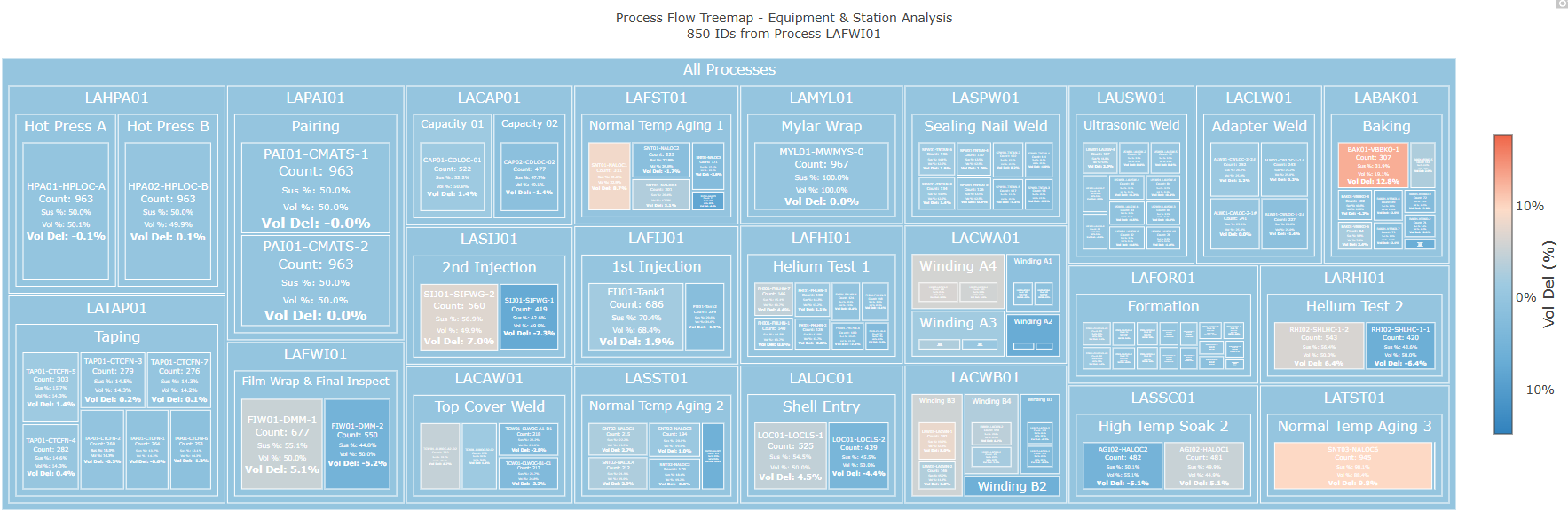 Gene Treemap: Shows input ID list route distribution through process
- The “Vol Del” refers to Volume Delta which is the difference between the precent of suspect product that passed through that route vs the precent of process volume that passed through that route (a higher delta is more suspicious)
Group Module
- Show groups of IDs overlayed on surrounding population
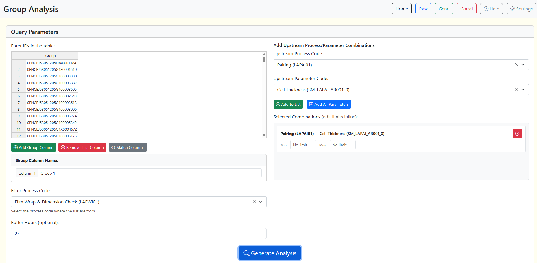 Group Page User Interface
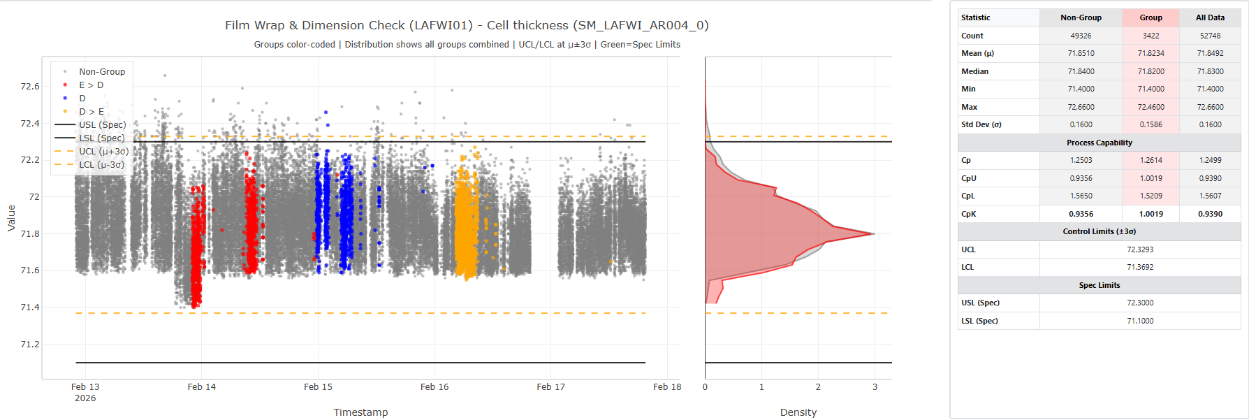 Trial Overlay: showing performance of trial groups in downstream parameter
Corral Module
- Compare two parameters with regression and statistical tests
- Determine whether suspect IDs deviate from expected relationships
- Visualizes population vs suspect behavior clearly
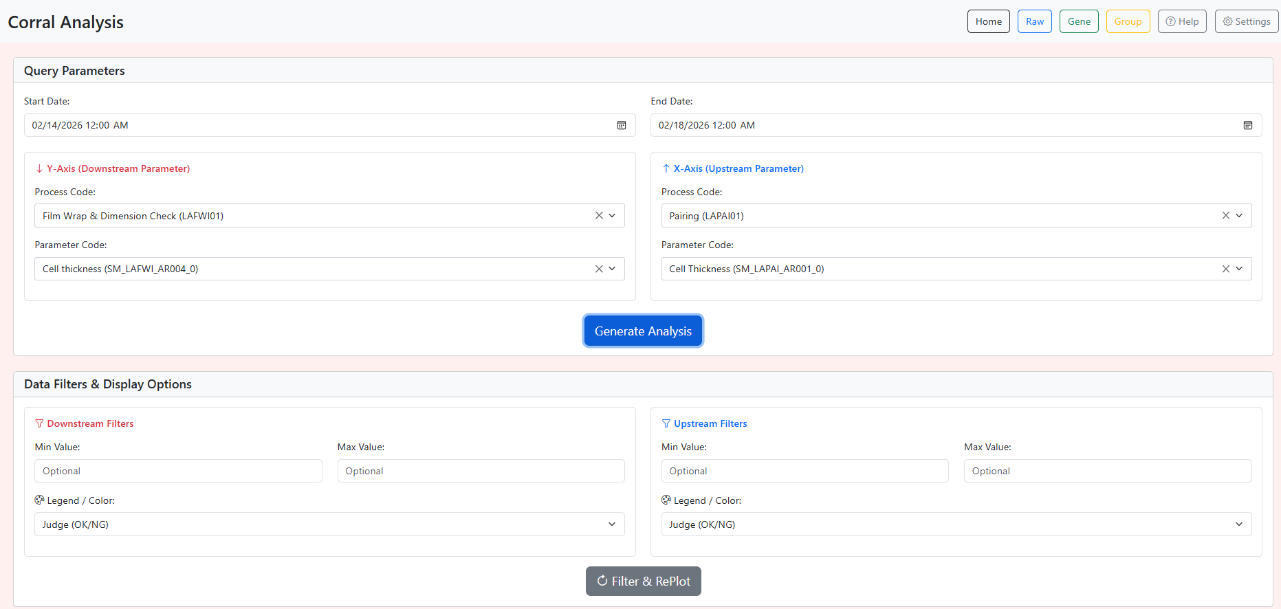 Corral Page User Interface
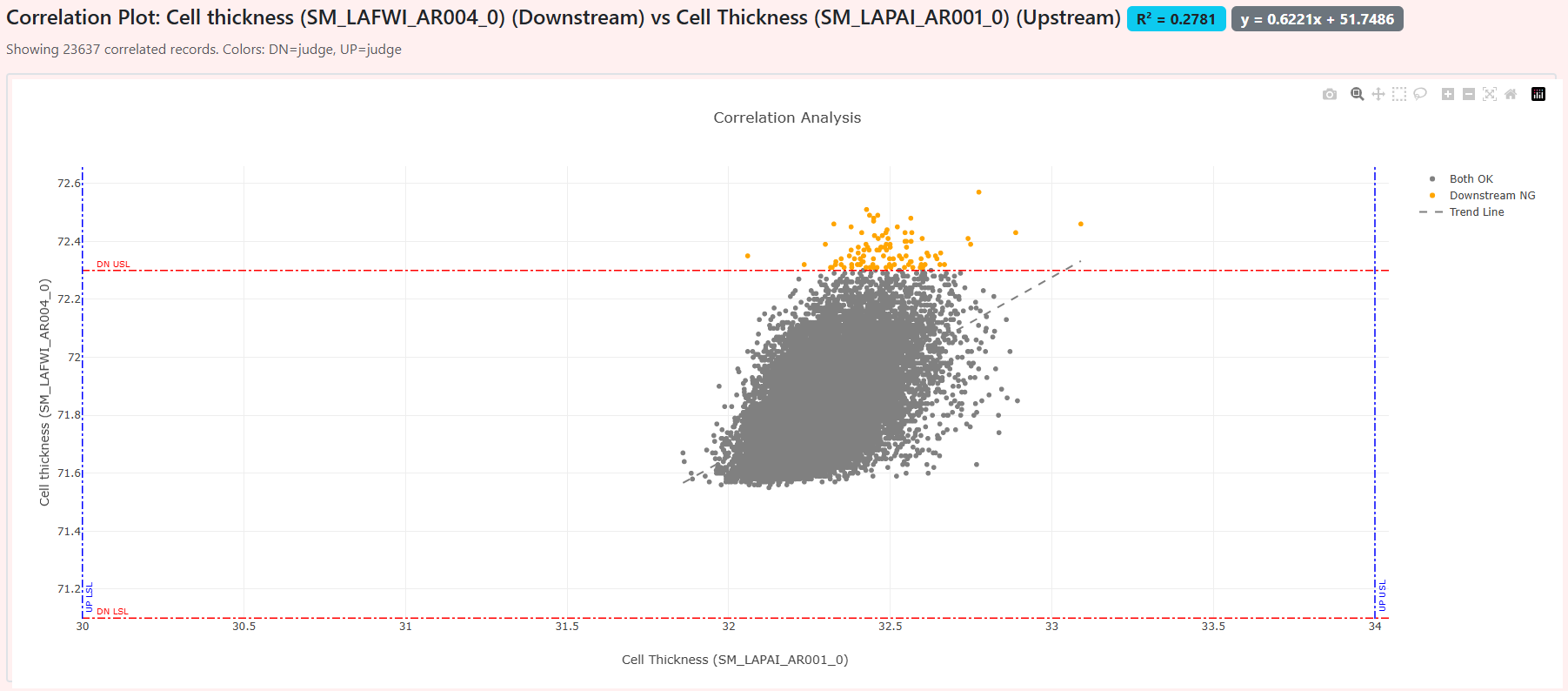 Correlation Scatter: Showing 2 Parameters on same plot
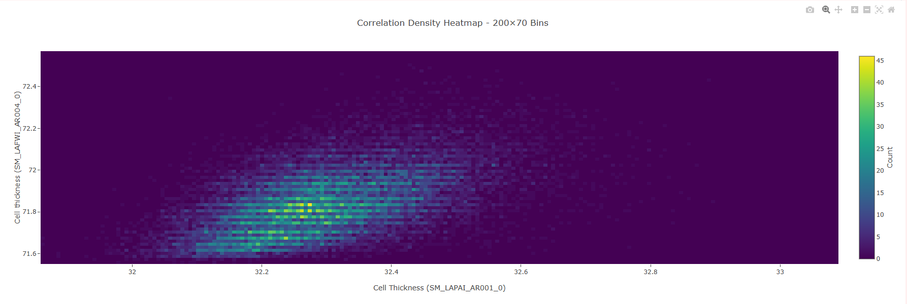 Correlation Heatmap: Showing Density of Correlation Scatter data
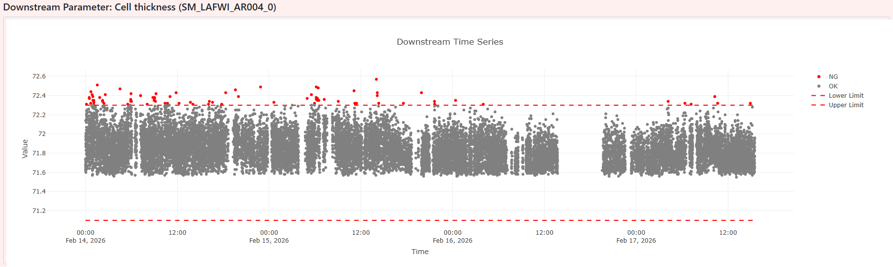 Downstream Parameter Time-Series: For Ensuring Clean Data Input
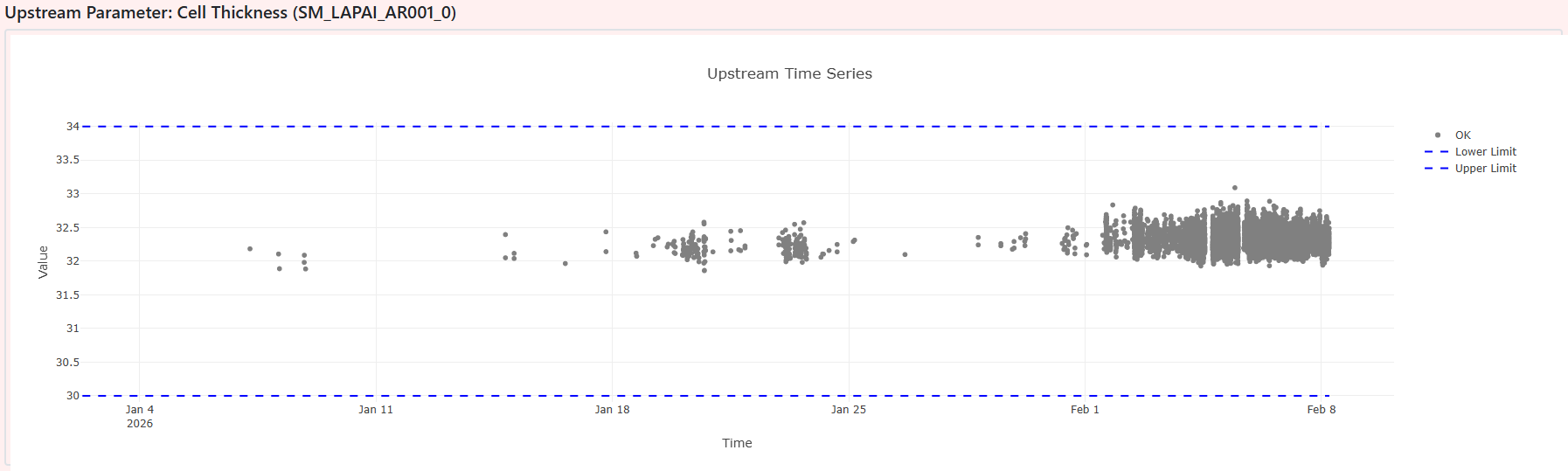 Upstream Parameter Time-Series: For Ensuring Clean Data Input
App Methodology
User Interface (UI)
There are multiple tabs across the top of the screen denoting different “modules”. Each module will have a unique user input section and a solution output sections. The output portion may have multiple tabs including various plots and the raw data for easy CSV export.
Backend
These separate modules will be linked to Python scripts that query SQL Datalake database and perform some analysis. The plots are generated using plotly.js in the web interface itself. This ensures the plots are quick and responsive, not relying on Python in the background to update.
Impact
- Created a single, repeatable investigation workflow for PE/QE teams
- Eliminated manual data wrangling and reduced analysis time dramatically
- Improved consistency and depth of root‑cause investigations
- Tool is now used as the primary upstream analysis platform
Code Repository
Due to proprietary production data, source code is not publicly available.